
Reading candles without the noise
There is an entire industry built on candlestick pattern names. Hammers, hanging men, three black crows, evening stars. Learn the fifty names, the story goes, and the chart starts talking to you.
Here is the part that gets left out. A candle contains exactly four numbers: where the period opened, the highest price traded, the lowest price traded, and where it closed. Every pattern name is a description of how those four numbers relate to each other. The name adds nothing. It only makes the relationship easier to talk about, and easier to see where it is not.
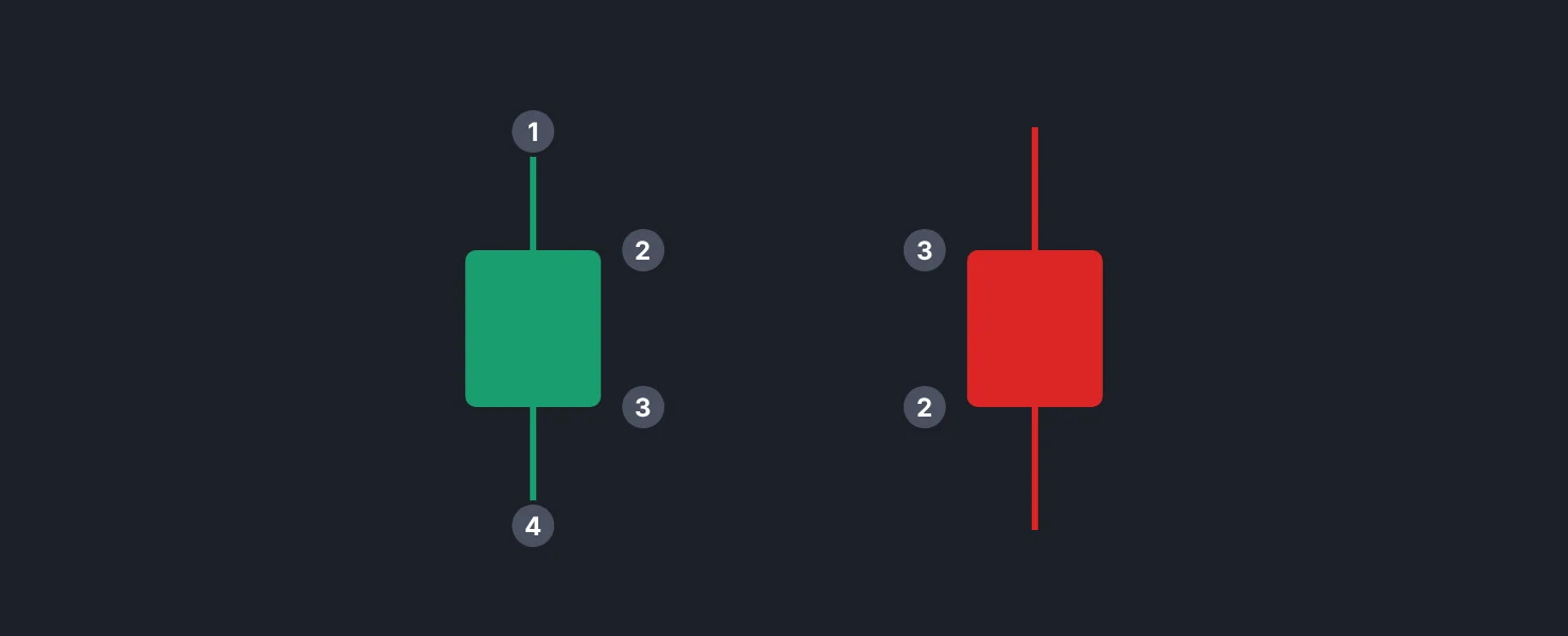
The four numbers, and what each one is worth
The close is the most informative of the four, and it is not close. The close is the last price both sides agreed on before the window ended. On a daily chart it is the price that survived a full session of everyone's opinions. The open is mostly an artifact of where the previous session stopped.
The high and the low tell you the range price was willing to travel. That is a volatility measurement, and it is the raw material for the average true range, which is what most systematic stop placement is built on. Indikora's exit is the highest price since entry minus three times ATR, which means those wicks feed directly into how far a stop sits from price.
The body is agreement, the wick is rejection. A long body means price moved in one direction and stayed there when the window closed. A long wick means price went somewhere and came back, so whoever pushed it there did not have enough behind them to hold it.
That is genuinely useful, and it is also the entire content of most pattern names. A "hammer" is a small body with a long lower wick. You do not need the word. You need to notice that price probed lower and got bought back.
Why the named patterns underperform their reputation
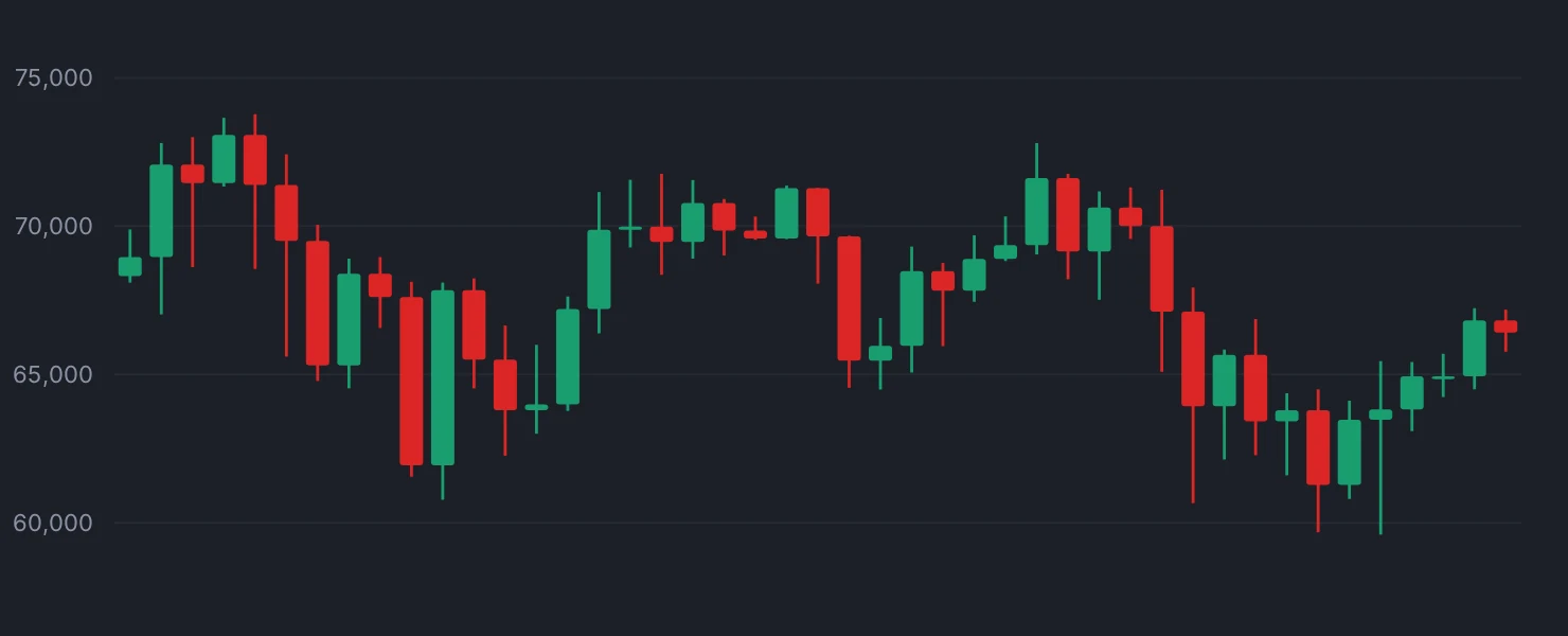
Most candlestick patterns were catalogued on 18th-century rice markets and never survived a proper statistical test. When people run them across large samples of modern liquid markets, the edge is usually somewhere between tiny and absent, and it is often smaller than the spread you would pay to trade it.
There are two structural reasons. The first is that a pattern is a description of two or three bars in isolation, and the same three bars mean completely different things at the top of a six-month run than they do in the middle of a range. Context does most of the work, and the pattern name deliberately throws context away.
The second is arithmetic. A "bullish engulfing" on the daily is just two 4-hour candles glued together in a particular way. Change your chart from daily to a session that closes two hours later and half your patterns disappear, because the boundary between candles is a calendar convention, not a market event. In crypto, where there is no official close at all, the daily candle boundary is whatever your exchange decided UTC means.
This is not an argument for ignoring candles. It is an argument for reading the numbers instead of memorizing the vocabulary.
What a candle can actually tell you
Range relative to recent range is the signal worth watching. A bar three times wider than the last twenty bars means something changed: information arrived, or liquidity vanished, or both. That is true regardless of color, and it is measurable without naming anything.
Where the close sits inside the bar's range is the second one. A bar that closes in the top tenth of its range says buyers had the last word for that window. A bar that closes in the middle says nothing was settled. You can compute that as a number rather than squinting at it.
A gap is a candle with a missing conversation. When a market opens far from where it closed, no trading happened in between, so there are no resting orders in that space. That is why gaps often fill quickly and also why they sometimes run: there is nothing there to slow price down either way. Twenty-four-hour markets like crypto and forex gap far less, which is one real difference between asset classes.
The habit that makes candles readable
Zoom out. Almost every candle that looks dramatic on a 5-minute chart is invisible on the daily, and almost every candle that matters on the daily is obvious without any interpretation at all.
Then stop asking what a candle predicts and start asking what it records. A long upper wick does not forecast a decline. It records that at that price, sellers outnumbered buyers for a while. Whether that persists tomorrow is a separate question with a separate answer, and the candle does not contain it.
The traders who read price well are not running a pattern lookup table in their heads. They are tracking two or three simple quantities across time: how wide is this bar compared to normal, where did it close inside itself, and did it happen near a price where people previously changed their minds. That is a short list, it takes about a week to internalize, and it survives being checked.
A candle is four numbers and a time window, and the pattern's name adds nothing the numbers did not already say.
Check yourself
Step through 40 daily bars and record two numbers per bar - its range as a multiple of the 20-bar average range, and where it closed inside its own range - then check which of those bars you would have noticed at all.
Bar replayIndikora has a free simulator, bar replay and a behavioral coach that reads your own trades.
Open the app