
Support, resistance, and why ranges exist
You draw a horizontal line under three lows that touched roughly the same price. The next time price comes down there, it bounces. It feels like the line did something. It did not.
Nothing on a chart has power over price. A line you drew has no budget. What is actually there is a cluster of orders sitting at similar prices, placed by people who never spoke to each other but arrived at the same number for the same boring reasons.
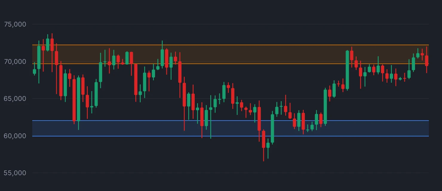
What a level is made of
Support is a price where enough resting buy interest sits to absorb the sellers arriving. Resistance is the same thing with the sides swapped. That is the whole mechanism.
Three separate groups tend to converge on the same price. People who wanted to buy last time it was there and missed, and left a limit order this time. People who bought higher, are underwater, and will sell to break even if they get the chance. And people running stop orders just beyond the level, because that is where "I was wrong" is cheapest to define.
That mix is why levels are zones, not lines. Orders cluster around a round number or an old high, they do not stack on a single tick. A level that held to the cent last time will overshoot by half a percent this time, and the level is still doing its job.
A level gets weaker every time it is used. Each touch consumes some of the orders sitting there. The fourth test of a support has fewer buyers behind it than the first, which is the opposite of the common belief that a level "proves itself" by holding repeatedly.
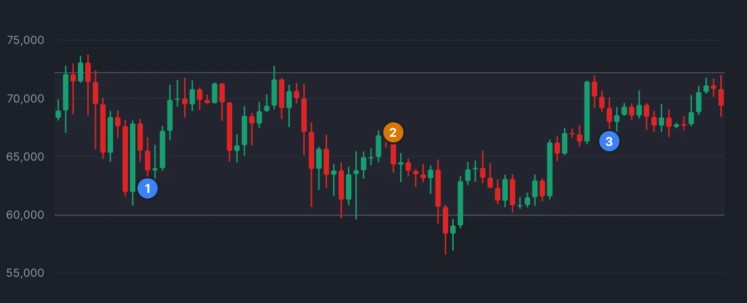
Why so many charts go sideways
Most people picture markets as trending with occasional pauses. The chart says the reverse: assets spend the majority of their time inside a range, and trends are the interruption.
A range exists when buyers and sellers disagree about direction but agree about value. Above a certain price, sellers think it is expensive and step in. Below another price, buyers think it is cheap and step in. Neither side can push through the other, so price oscillates between two order clusters until something changes the disagreement.
That "something" is usually information: an earnings number, a rate decision, a large participant who needs to move size regardless of price. The lesson "What actually moves a market" covers where that pressure comes from. Until it arrives, the range is not a failure of the market. It is the market working.
This matters practically because range behavior and trend behavior punish opposite habits. Buying weakness works inside a range and bleeds you in a downtrend. Buying strength works in a trend and bleeds you in a range. Most beginners are not bad at either one. They are applying the right habit in the wrong regime.
Breakouts, fakeouts, and where the stops live
Price leaves a range when one side's orders are exhausted, and it usually leaves violently. Once the resting sellers above a range are filled, there is thin air above them until the next cluster, so the move is fast and looks like conviction.
It is not always conviction. Sellers and buyers both know where the obvious level is, and stop orders sit just beyond it. A push through the level triggers those stops, which produces exactly the kind of sharp candle a breakout produces, then price falls back inside. Nobody manufactured that on purpose in most cases. The order book simply had a hole there.
You cannot tell the two apart at the moment they happen. Anyone who claims otherwise is describing charts they already know the ending to. What you can do is treat the first candle through a level as a hypothesis rather than a confirmation, and size accordingly.
Drawing levels without lying to yourself
If a level requires more than about ten seconds to find, it is probably not there. Real clusters are obvious: a clear old high, an old low, a shelf where price stalled for days, a round number. If you are stretching a line to make it touch four wicks at slightly different heights, you are not finding a level, you are drawing one.
Two habits keep this honest. Draw levels on a higher timeframe than the one you are looking at, so you are not reacting to noise. And mark them from the left edge of the chart forward, before you look at what happened next, so the outcome cannot influence the placement.
Indikora does not trade levels directly. Its trend conditions and its chandelier exit both work off price and volatility rather than drawn lines, precisely because a hand-drawn level cannot be verified or hashed the way a numeric rule can.
A level is a record of where people previously changed their minds. That is genuinely useful information, and it is not a prediction. Price is under no obligation to stop there, and it frequently does not. Read the level as "here is where supply and demand collided last time", and the sideways stretches of a chart stop looking like broken trends.
Support and resistance are zones where resting orders pile up, not lines the price is obliged to respect.
Check yourself
Pause a replay at a random past date, mark the three most obvious levels using only the data on screen, then step forward 30 bars and note how far price overshot each one.
Bar replayIndikora has a free simulator, bar replay and a behavioral coach that reads your own trades.
Open the app