
Timeframes: why the daily chart lies less
Open the same asset on a 5-minute chart and a daily chart at the same moment. One is collapsing, the other is grinding higher. Nothing is broken. You changed the resolution, and the picture changed with it.
New traders usually take this as a puzzle to solve, as if one of the two charts is the real one. Neither is. A timeframe is a sampling rate, and every sampling rate throws away different information. What matters is knowing what each one keeps.
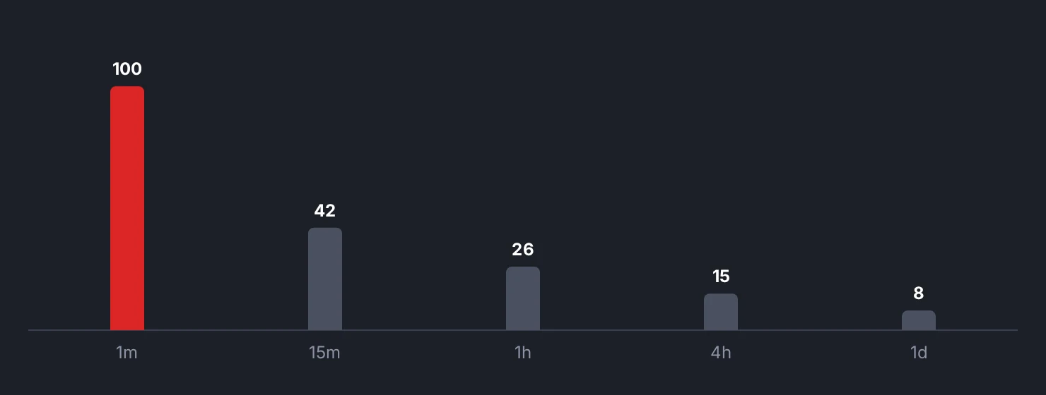
Noise does not shrink when you zoom in
Here is the mechanism that makes short timeframes hard, and it is not psychological.
Some of every price move is information and some is friction. The friction is the bid-ask bounce, one large order clearing a thin book, a market maker adjusting quotes, a stop cluster triggering. That component is roughly the same absolute size regardless of what chart you are looking at, because it comes from the order book, not from the calendar.
The information component, on the other hand, scales with time. Real repricing happens because something changed, and over a day more things change than over five minutes.
So as you shorten the timeframe, the informative part of the move shrinks and the frictional part does not. On a 1-minute chart, most of what you see is the market's plumbing. On a daily chart, that same plumbing is a small fraction of a much larger bar.
This is why the same trend rule applied to a 5-minute chart flips ten times a day and applied to a daily chart flips a handful of times a year. The rule did not get worse. The input got noisier.
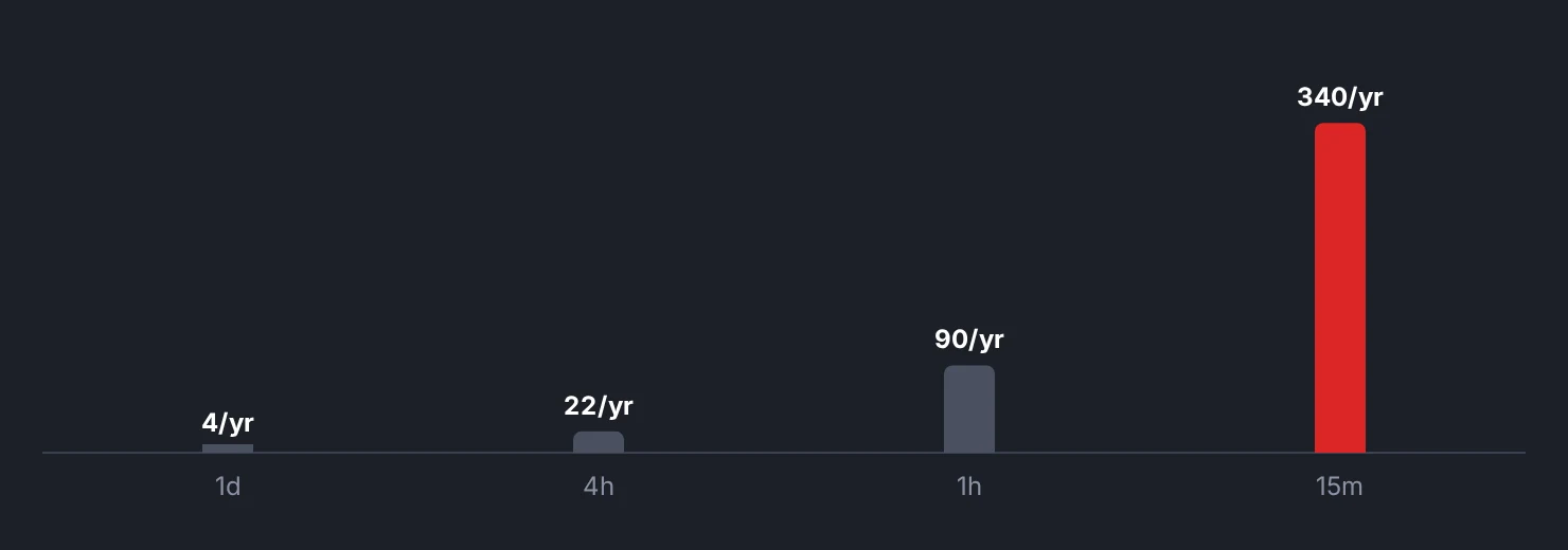
The cost side compounds the problem
Short timeframes do not just carry worse signal. They also charge you more for it.
A trade held for six minutes and a trade held for six weeks pay roughly the same spread and the same commission. But the six-minute trade is trying to capture a move that might be 0.1% while paying 0.15% to do it, and the six-week trade is trying to capture 8% while paying the same 0.15%.
Costs are fixed per trade, and the size of the move you are trying to catch is not. The lesson "Spread, slippage and fees: the invisible tax" runs the annual arithmetic. The short version is that frequency is the most expensive variable you control.
There is also an execution asymmetry. On a daily chart you have hours to place an order and the exact tick barely matters. On a 1-minute chart, a two-second hesitation is a meaningful fraction of the move you were after.
What lower timeframes are genuinely good for
This is not an argument that short charts are useless. It is an argument that they answer a narrower question.
Lower timeframes are precision instruments, not decision instruments. If you have already decided, on evidence from a slower chart, that you want exposure to something, a faster chart can help you place the order in a tighter spot and set a stop that is not absurdly wide.
They are also where liquidity is visible. A 1-minute chart around a scheduled release shows the book emptying and refilling in a way a daily bar completely hides. That is real information about execution conditions, which is different from information about direction.
The problem starts when the fast chart is used to make the decision the slow chart was supposed to make. That is where the reversal you saw on the 3-minute chart becomes a reason to abandon a position that has not violated anything on the daily.
Pick one timeframe to be right on
The most common self-inflicted wound in retail trading is entering on one timeframe and managing on another. You buy based on the daily, then watch the 5-minute, then exit on a 5-minute wobble that the daily will not even record as a down day. The entry logic and the exit logic are now measuring different things, and the combination has never been tested by anyone, including you.
The fix is unglamorous. Decide which chart your rules live on, and check that chart at that frequency. If your system is daily, looking at it eight times a day gives you no additional information and a great deal of additional temptation.
Indikora is explicit about this: its trend conditions and its chandelier stop are both evaluated on the daily timeframe. The Coach, which classifies each trade decision as rational, FOMO, revenge, fatigue, overconfidence or overtrading, exists partly because timeframe drift is one of the most reliable ways a sound plan turns into an unsound one.
Time does not remove uncertainty, and the daily chart is not truthful in any absolute sense. It is simply less contaminated. If you are early enough in your learning that you cannot yet tell noise from information, the slower chart makes the distinction for you, which is the closest thing to a free advantage available to a beginner.
Noise stays roughly constant as you zoom in while real movement shrinks, so shorter timeframes carry a worse signal-to-noise ratio.
Check yourself
Replay one month of an asset on the daily and count how many times your trend rule flipped, then repeat on the 1-hour chart and compare the two counts.
Bar replayIndikora has a free simulator, bar replay and a behavioral coach that reads your own trades.
Open the app